Widgets
Widgets help you organize a big scope of data in the most convenient and informative way. Use them to view items in the lists, group and visualize statistics, and control the workload.

- To enlarge widget to the dashboard size, click
 in the upper-right corner.
 - To open the full list of items on a separate tab, click the widget title.
List is the most traditional way to view items. Select list when you want to see basic information such as title, type and other details about each item.
- To view full information about an item on its detail page, double-click the item .
- To sort a list by values in a column, click the column heading. To sort the list in the opposite order, click the heading one more time.
- To show only those list items that meet specific criteria, click
 on the relevant column heading and define the criteria.
Select the donut chart when you want to view the ratio between different groups in a list. You can select a parameter for grouping when you apply the donut chart type to a widget.
- To view matching of groups and related colors, select the Display legend check box.
- To view the group name and number of items in it, hover the mouse cursor over it.
- To view a group list on a separate tab, click the related piece of donut chart.
Bar chart represents different groups in a list in the alternative to the donut chart way. The bar chart provides an additional functionality - setting a threshold. Thresholds are convenient way to visually control the workload. When a specific bar exceeds the threshold, the background color above this threshold becomes pink. For example, you can add a widget with cases grouped by responsible unit. If the number of cases for a specific unit exceeds the set threshold, you can easily see it and allocate some cases to other units.
You can select a parameter for grouping and the threshold value when you apply the bar chart type to a widget.
- To view matching of groups and related colors, select the Display legend check box.
- To view the group name and number of items in it, hover the mouse cursor over it.
- To view a group list on a separate tab, click the related bar.
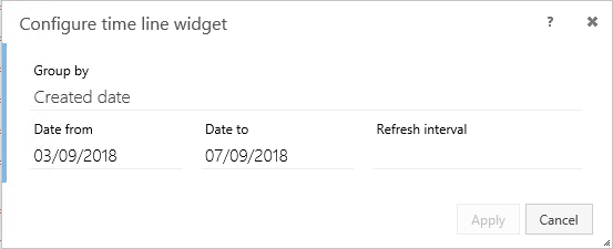
Time line is a valuable functionality that makes it possible to control and evaluate workflows by time. For example, you can easily check how many documents you must reply during the current week or you can evaluate efficiency of a certain unit for a specific period.
To configure a time line, select a parameter to group the values by and specify a time period:
- To specify a certain period, enter the dates or select them from the calendar, for example, 25/05/2018.
- To specify a relative period, for example the previous week, enter the relative dates:
Tip: See more options on How to set a relative date.
- By default, the time line presents a time period that was set during its configuration. If you want to view a line chart for a smaller period, use the left mouse button to highlight the needed dates in the history graph below.
- To view all items for a specific date on a separate tab, click the related point on the graph.
Counter displays the number of items in a list, allowing you to quickly gain an overview of the status of the list. The color of the number indicates where the counter value lies within a predefined range of values.
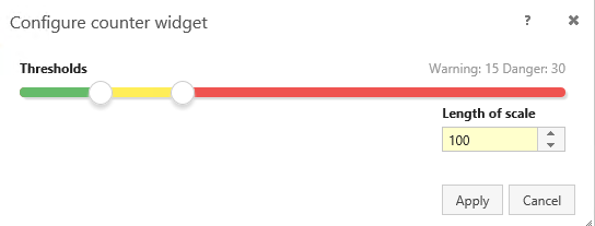
Counter thresholds
There are three ranges: Red, Yellow and Green which you can define threshold values for.
- Green: The counter value is less than the threshold value defined for the red color. The green color is classified as Safe in the widget configuration. The default value is 0-5.
- Yellow : The counter value is between the threshold value defined for the green color and the threshold value defined for the red color. The yellow color is classified as Warning in the widget configuration. The default value is 5-30.
- Red : The counter value is greater than the threshold value defined for the green color. The red color is classified as Danger in the widget configuration. The default value is 30-100.
Drag the sliders for each color to define the threshold values during the counter configuration.
Length of Scale
You can define the scale length in the Length of Scale field which determines overall range of the counter value in the widget. The default Length of Scale value is 100.
Refresh Interval
To set how often the counter is recalculated and the widget is refreshed, select the relevant refresh rate from the list in the Refresh Interval field.
Reverse thresholds
If higher counter values are preferred and lower counter values are candidates for warnings or require attention, select Reverse thresholds which associates the green color with higher threshold value and the red color with the lower threshold value.
The Speedometer widget enables you to display the number of items in a list (a counter value) with a visual depiction of where the counter value is placed within a particular predefined range of values.
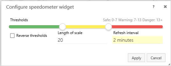
Counter thresholds
There are three ranges: Red, Yellow and Green which you can define threshold values for.
- Green: The counter value is less than the threshold value defined for the red color. The green color is classified as Safe in the widget configuration. The default value is 0-5.
- Yellow : The counter value is between the threshold value defined for the green color and the threshold value defined for the red color. The yellow color is classified as Warning in the widget configuration. The default value is 5-30.
- Red : The counter value is greater than the threshold value defined for the green color. The red color is classified as Danger in the widget configuration. The default value is 30-100.
Drag the sliders for each color to define the threshold values during the counter configuration.
Length of Scale
You can define the scale length in the Length of Scale field which determines overall range of the counter value in the widget. The default Length of Scale value is 100.
Refresh Interval
To set how often the counter is recalculated and the widget is refreshed, select the relevant refresh rate from the list in the Refresh Interval field. The default value is 2 minutes.
Reverse thresholds
If higher counter values are preferred and lower counter values are candidates for warnings or require attention, select Reverse thresholds which associates the green color with higher threshold value and the red color with the lower threshold value.